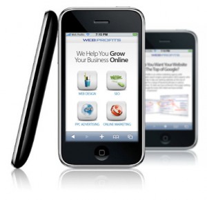
Mobile Wesite Development
 With smart phones and 3G (high-speed internet), users are more on Mobile than on PC. Now more and more users are looking for you while on the move and on their mobile. Regular Websites do not work well on Mobile devices due to following reasons:
- Mobile Screen resolutions
- Bandwidth differentiation
Usually websites appear to be all jumbled up or are very difficult to navigate through, when accessed via a mobile phone or a smart phone. Try opening your existing website on your Blackberry, iPhone, Android, Nokia or any other mobile phone that you use. You will see that the experience of browsing your site is not the same, when viewed on a Desktop or a Laptop.
It's important to design and develop a Mobile friendly website, i.e. a Mobile version of your Website so users trying to access you on the move are able to get to your website, access the right information in the quickest time and be able to get in touch with you directly through their mobile. For WAP and Mobile Website for your company contact us today. The mobile version of the website that we design and develop can be
- Easily accessed on smart phone browsers such as the Blackberry, iPhone, Andorid and Nokia
- Accessed on a variety of browser dimensions ranging from the smaller screens to the more popular larger screens (128 x 160 pixels, 176 x 220 pixels, 240 x 320 pixels and 320 x 480 pixels)
- Used as an information dissemination platform for people accessing your website from a mobile phone.Programmed to fetch information from existing databases.
